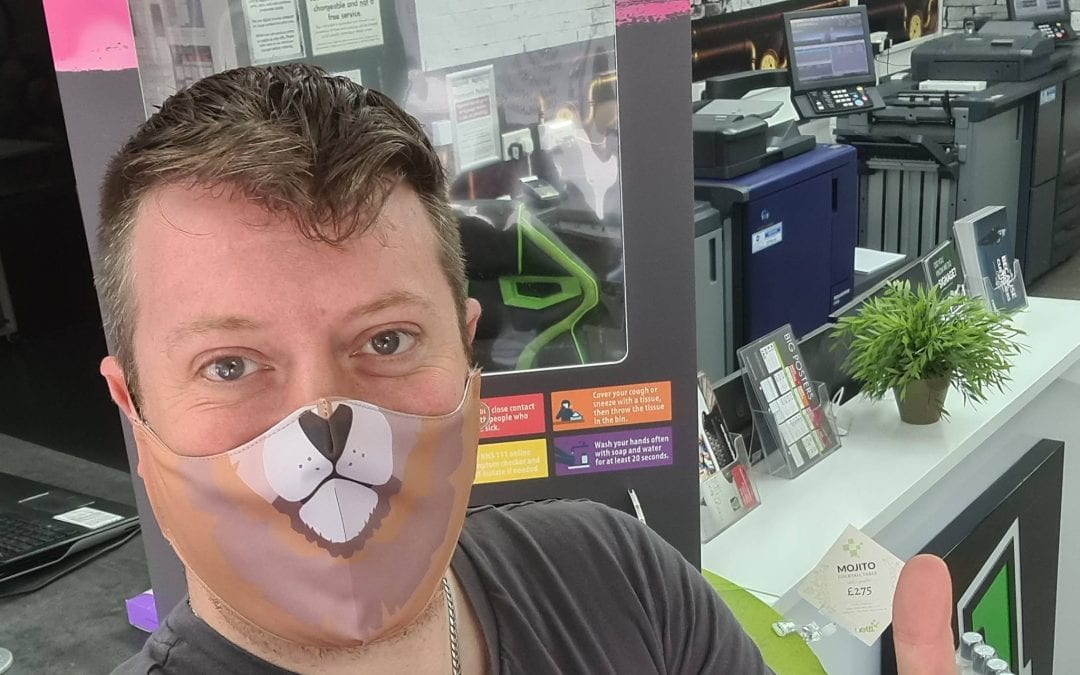
With the chaos that’s insured these past few months, many businesses have been forced to create and develop covid-19 coronavirus signage that keeps both their employees and customers safe.
It’s no surprise that Nettl at Digiprint have had to adapt to the changing requests, particularly with an increase in demand for coronavirus-related designs. However, coronavirus signage isn’t exactly a fun topic for anyone or one that warrants creativity usually.
Yet, with a bit of know-how, designs which offer protection and commercial benefit with a bit of brand flair can be produced.
Our following tips will provide you with simple guidelines to ensuring your Covid-19 coronavirus signage protects customers and adheres to government regulations. Plus also helps to improve your business and keep the money flowing.
View our range here: Coronavirus signage

Make Sure the Signage is on Brand
When designing things like protection Signage, it’s important to make sure it stays branded. Your covid signage needs to remain cohesive with the surround spaces, integrating nicely with your work environment.
Best practice is to create your covid-19 coronavirus signage with on-brand colouring and messaging. Use phrases that resonate with your brand and present your personality as best you can. Whilst staying professional and ensuring the safety of your customers.
The use of good old British humour also puts customers at ease and knocks back the severity of safety signage without losing the serious message.
When considering your safety signage, you can also use differing materials to create impressive looks. It’s important to standout and creative designs could also land PR opportunities if it executed well that could go viral.
Don’t be afraid to change your tone of voice
Many brands have plain, boring voices or some are within industries that wouldn’t be considered “exciting”. Some brands and companies can struggle to justify branching out and having fun with their image for Covid-19 signage.
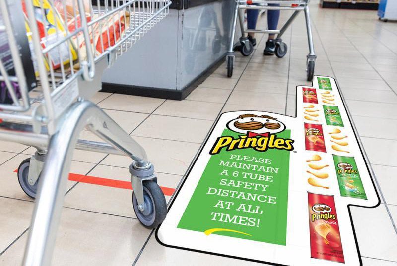
You should never be afraid to deviate from the image you’re currently pushing. Especially if it leads to creativity and an interesting design that grabs attention, gets you noticed and continues to inform customers with sound information.
Be bold and use this opportunity to develop a new voice for your brand. Make it playful and inviting. People don’t really want to see hazard signs when entering a store or business so play with different ideas.
Add a splash of colour, keep it within your brand colours maybe and use unique phrases to keep your customers safe and give your brand a voice.

Wayfinding and Signage to Simplify the Customer Journey
Using signage to guide customers through your store can help them get around faster and more efficiently.
Creating signage and wayfinding designs is just as about the customer as it is about the brand. You need to get inside your customer’s head. Understanding how they’re thinking, feeling, and what they’re in need of when entering your store or business.
Ask yourself what mindset the customer is in when they’re leaving their house and entering your business. What are they expecting, and will they be concerned in anyway? Clever thought into this customer journey around your store will simplify their shopping process and they will feel safe to buy.
It’s important to broadly look at the complete customer journey when evaluating the design and location of your signage.
Placing “Welcome Back” signs on the front doors is inviting. Direction cues on flooring decals makes sure everyone knows where they’re supposed to be standing.
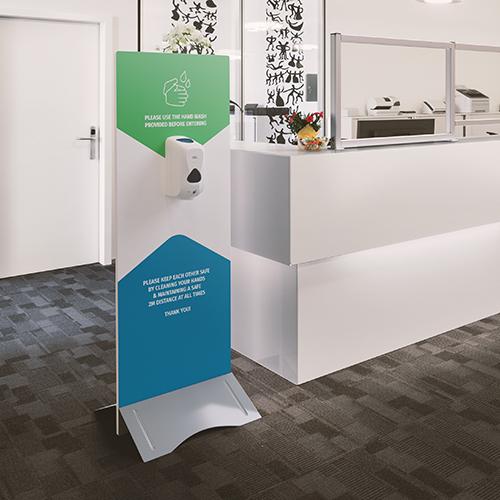
Branded hand sanitiser stations are also great ways to direct customers to be safe and an information point.
It is a good idea to think about how your customer moves around your business and adjust the Covid-19 signage appropriately.
Use a Friendly Voice
Making sure that you’re portraying a calm and friendly voice is essential when designing your signage for Covid-19.
Entering a store with signs implying danger, viruses, and stress can turn off your customer. Maybe even making them think negatively about your brand.
Switching the messaging to something more welcoming, can change the perception of the signage and calm people who are entering.
If you’re not a fan of custom designs, you may feel a need to take a standard sign design with little alteration. This can leave you with a bland message that can sometimes cause stress for your customer.
It isn’t just about the messaging and voice, however. Colouring and typography also play a role in presenting a friendly, welcoming persona when customers enter.
Using bright, colourful pallets. Themed with your brand colours and playful typography it can make a huge difference to how your signage is seen.
Additionally, making the messaging/tone appear collective and communal can have a huge impact on how your customer feels. Letting them know you’re in this together can bring them closer to the brand, create positive sentiment and build trust.
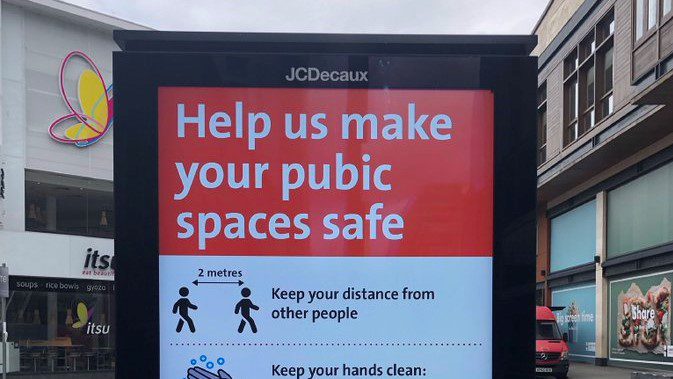
Just make sure you proof check before going to print to avoid those embarrassing mistakes that give totally the wrong message!
Why not use This Chance to Create a Campaign
The signage you use doesn’t only have to help the customer and guide them throughout the store. It can also be used to push an idea or community you support, especially one that aligns with the beliefs and values of your customer.
Businesses are using advertising space as a way to support the NHS and let their audience know they’re in this together.
It is also possible to create signage and designs that display a positive message that supports a cause and keep it on brand.
You shouldn’t be afraid to be cheeky and fun, there’s nothing worse than being boring! Have some fun and create a warm, welcoming and safe environment.
